Exploring the power of brand refreshment: Anmlex Industries’ journey to a bold new identity
In today’s fast-evolving market, a company’s brand needs to do more than just look appealing—it must communicate the essence of the business, connect with its audience, and evolve alongside the company’s growth. Anmlex Industries, an established name in the industrial sector, recognized this need and embarked on a transformative brand refresh journey.
The Need for a Brand Refresh
Every brand refresh begins with a reason—a business evolution, market shift, or the need to appeal to a new audience. For Anmlex Industries, the decision to refresh its brand was likely driven by a combination of these factors. As an established player in the industrial sector, Anmlex needed to modernize its identity to reflect its growth, innovation, and commitment to quality.
The challenge was clear: how could Anmlex retain the trust and authority it had built over time while presenting itself as a forward-thinking company ready for the future? The result is a dynamic yet refined redesign that masterfully connects the old with the new.
The Importance of Brand Storytelling
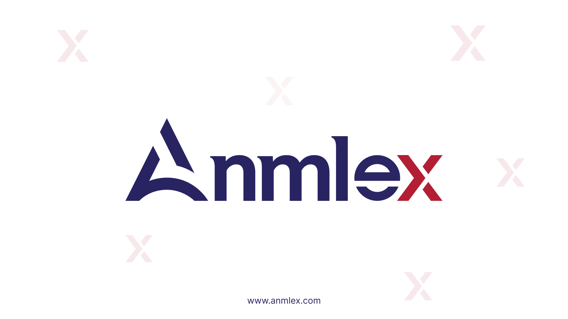
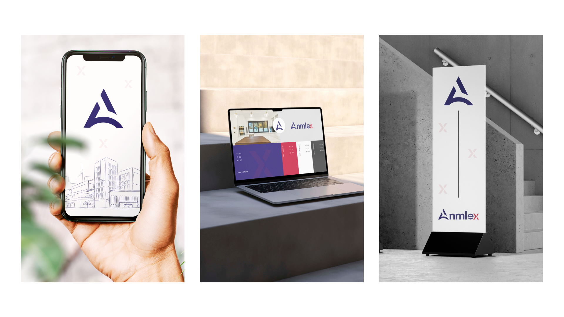
One of the key takeaways from the Anmlex Industries refresh is the emphasis on storytelling through design. Every element of the new visual identity has a purpose and tells a part of the Anmlex story. The minimalist logo, for example, not only looks sleek and modern but also represents the brand’s core values of simplicity, efficiency, and strength in its products and services.
Storytelling through branding allows companies to connect with their audience on a deeper level. Anmlex successfully uses this approach by weaving its values into its design, giving customers a clear understanding of who they are and what they stand for at first glance.
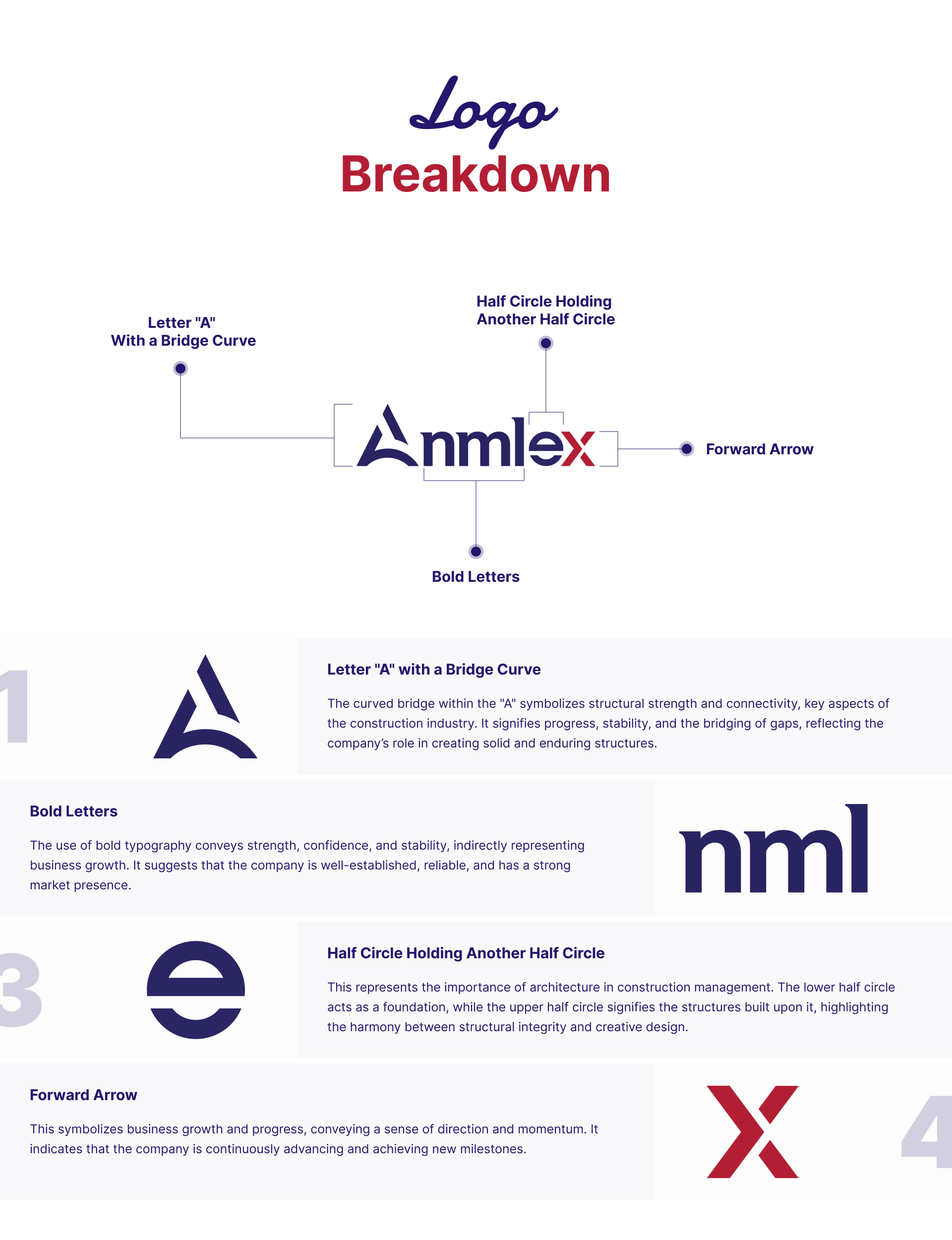
Impact of Color in Redefining Anmlex Industries' Brand Identity
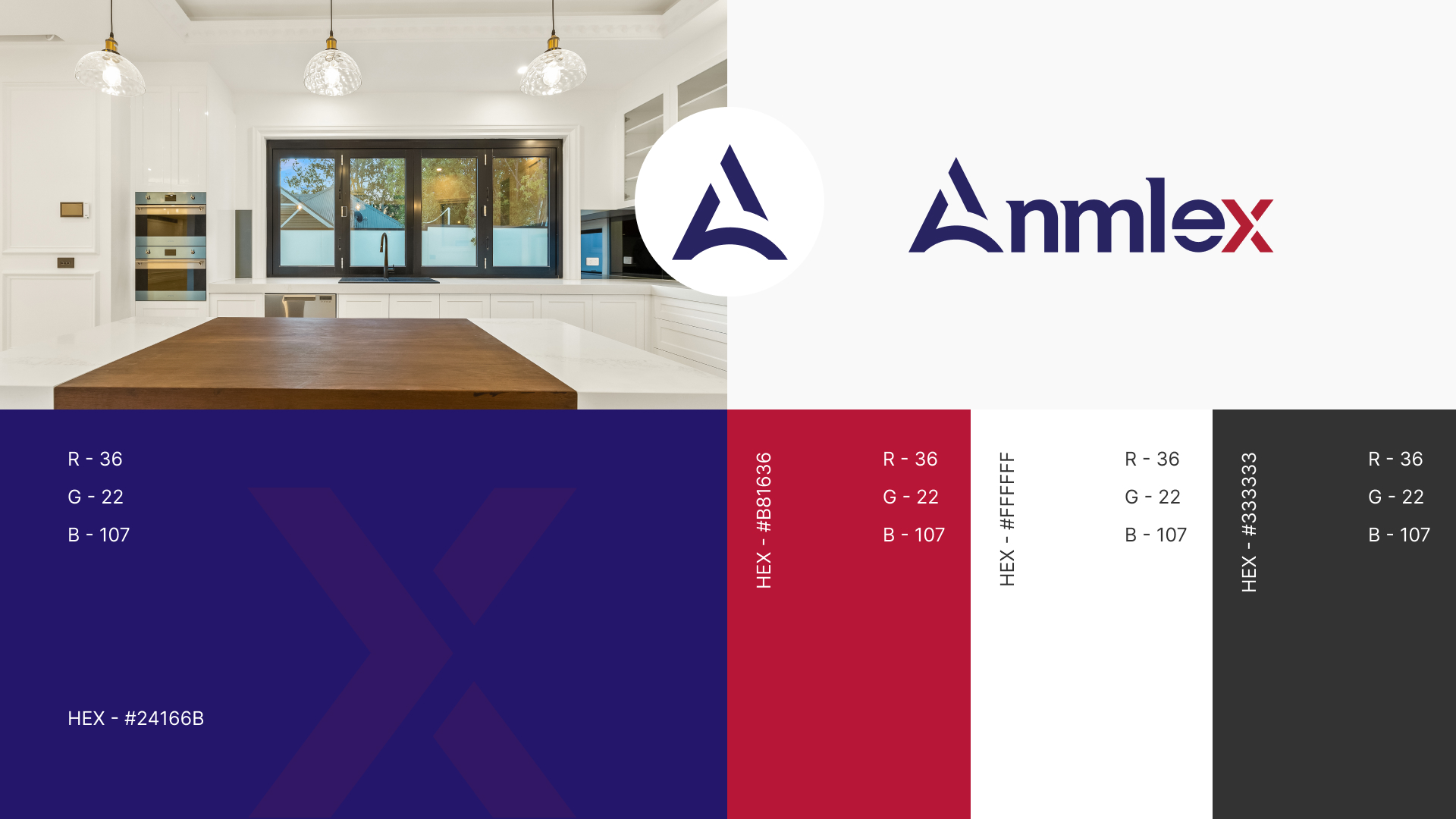
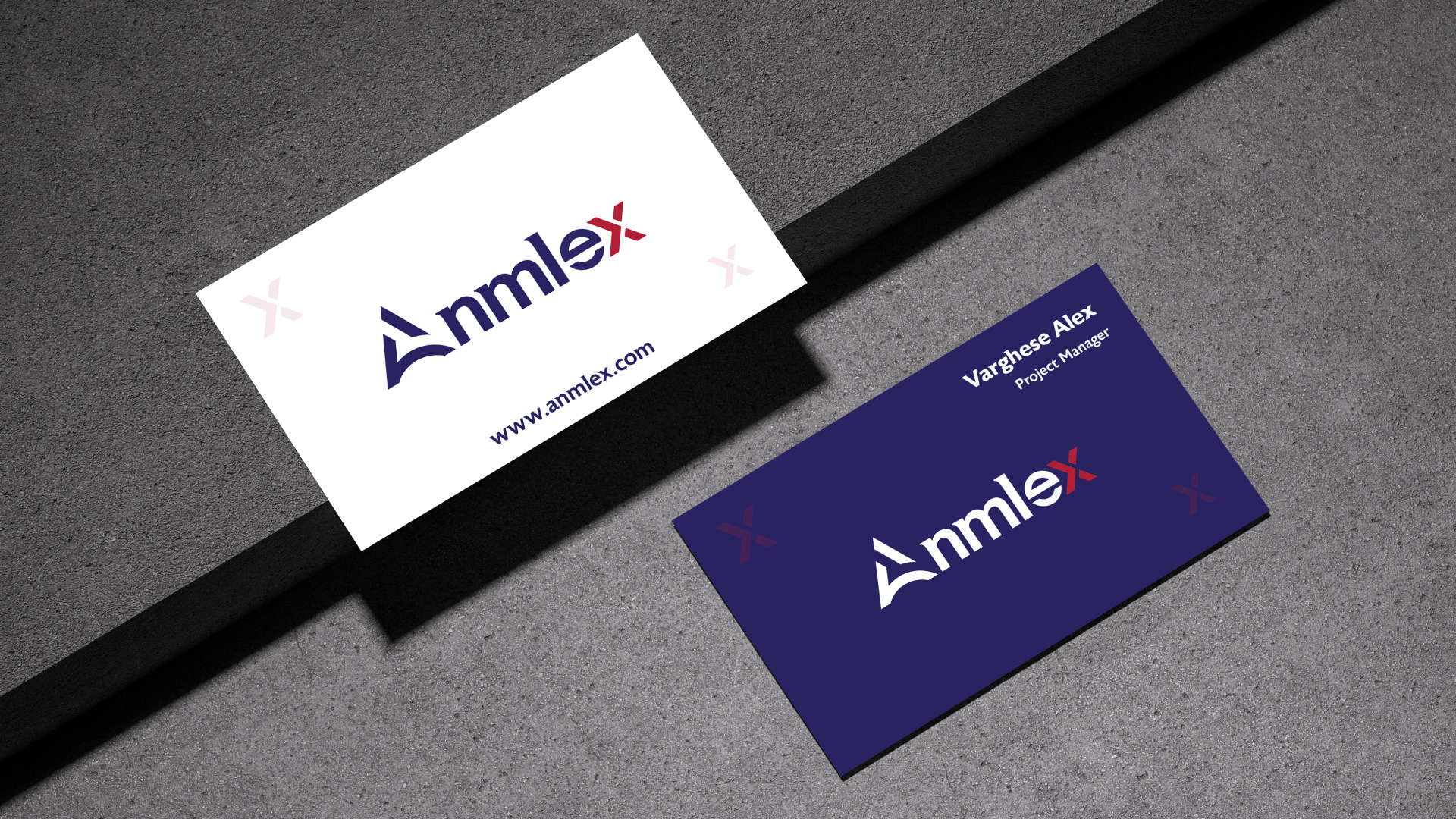
In the Anmlex Industries brand refreshment process, the strategic selection of colors plays a vital role in shaping the brand’s modern identity. The logo prominently features navy blue and bold red, which together evoke a sense of professionalism, reliability, and strength.
- Navy blue symbolizes trust, expertise, and authority—key attributes for an industrial company like Anmlex.
- The red “X” adds energy and dynamism, representing innovation and forward-thinking, contrasting yet complementing the blue to strike a balance between tradition and modernity.
This thoughtful combination not only maintains Anmlex’s heritage but also signals its readiness for future growth and innovation.
Typography
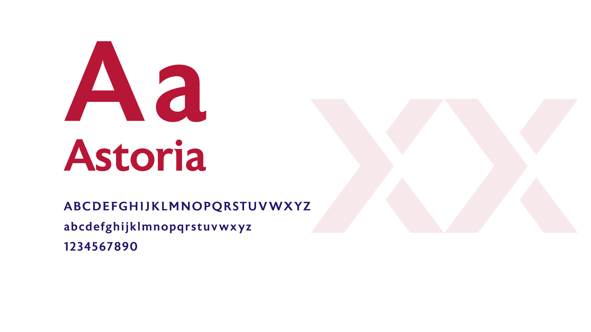
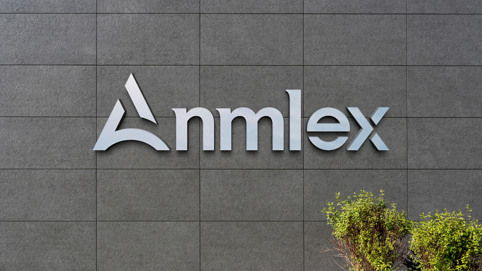
The Anmlex Industries logo typography is a strategic blend of modernity and professionalism that effectively represents the brand’s identity.
Font Choice: The logo uses a clean, sans-serif typeface that conveys a sense of modernity and clarity. This choice reflects Anmlex’s commitment to innovation while maintaining a professional image suitable for the industrial sector.
Character Weight: The boldness of the typeface emphasizes strength and reliability, aligning with Anmlex’s core values. This robust character instills confidence and trust in the brand, essential for engaging with clients in a competitive market.
Letter Spacing: The well-balanced letter spacing contributes to readability and visual appeal, ensuring that the brand name is easily recognizable. This clarity is vital for effective communication and enhances brand recall.

Conclusion
This refreshed identity not only enhances brand recognition but also positions Anmlex as a forward-thinking leader in the industrial sector, ready to embrace future challenges. As the company continues to grow, its revitalized branding will serve as a strong foundation for building lasting relationships with clients and stakeholders. Ultimately, the Anmlex Industries brand refresh exemplifies how strategic design can foster deeper connections and create a lasting impact in a competitive market.
